How do you create an effective call to action?
A call-to-action (CTA) is an essential tool for converting your website visitors into qualified prospects.
By directing users to a landing page—a dedicated page on your website where visitors "land" after clicking a CTA—it plays a crucial role in any inbound marketing strategy.
Want to learn more about call-to-actions and discover the best practices for optimizing them? This article is for you!
Expert opinion
My experience in website architecture allows me to see daily how critical CTA placement is on any page. It's clear that a high-performing CTA relies on strategic positioning for dynamic conversion, but also on being simple and transparent. My daily guiding principle is this: an effective CTA must first and foremost be clear, precise, and present a direct benefit to whoever interacts with it. More than just an invitation to action, it represents a promise of intrinsic value. And if there's one constant in my professional routine, it's the need to continuously test, evaluate, and refine. In the digital world, staying static isn't an option—what works today might need adjustments tomorrow.
What is a Call-to-Action?
Definition of a Call-to-Action
A call-to-action, or CTA, is a clickable element commonly found on website pages, blog articles, or emails. The goal is to influence users to take a specific action as part of a marketing strategy, helping them advance through their conversion process and buyer's journey.
For example, different types of actions include:
- Download a guide
- Register for a webinar
- Subscribe to a newsletter
- Request a demonstration
- Add to cart...
A CTA can take various forms: an image, a button, a pop-up, a link, etc. It most often leads to a landing page—a dedicated page focused on the offer initially presented by the CTA (such as downloading a white paper, webinar registration, or booking an appointment).
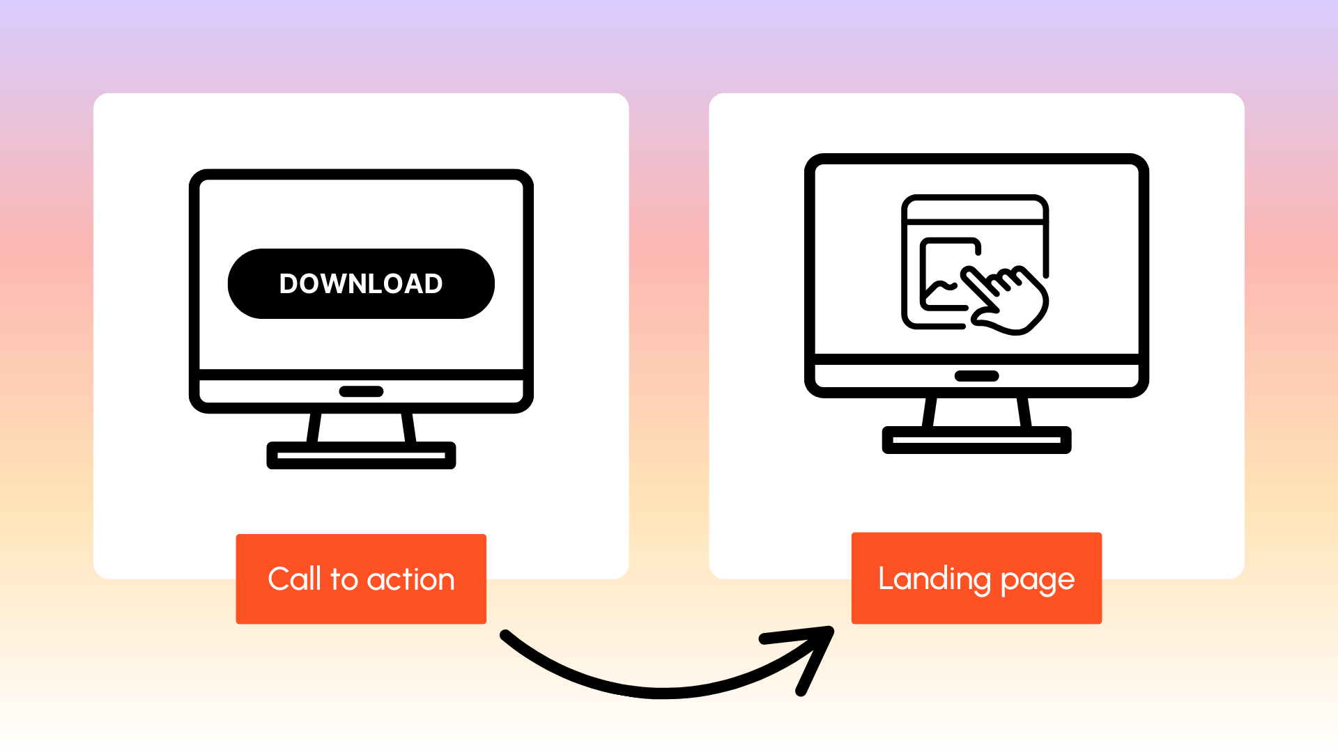
You're starting to understand that a call-to-action is much more than a simple button! It's one of the pillars of a solid inbound marketing strategy. However, its objectives and implementation can vary depending on:
- Your chosen target audience
- Their level of maturity
- The action you want them to take
💡 Best Practice: You can also implement a "smart" CTA. Here's an example: a visitor downloads a white paper, which means that during their next visit to your website, a new download will be offered to them. The CTA then adapts to the user, allowing you to personalize your contacts.
Call-to-Actions in Inbound Marketing Strategy
As explained earlier, CTAs are essential elements in your inbound marketing strategy. They're the link between your content (which attracts users) and your offer (which converts visitors into leads).
For example, an unknown visitor starts reading your blog. During this reading, they encounter a CTA in an article: "Download our template."
- First, they'll land on the landing page associated with the CTA
- They'll then learn about the offer
- And fill out the form to access the template in question
And there you have it—you now have one more lead in your database! But call-to-actions are especially valuable during the lead-to-prospect conversion stage. They trigger this conversion. We say that CTAs are the indispensable element of your conversion funnel.
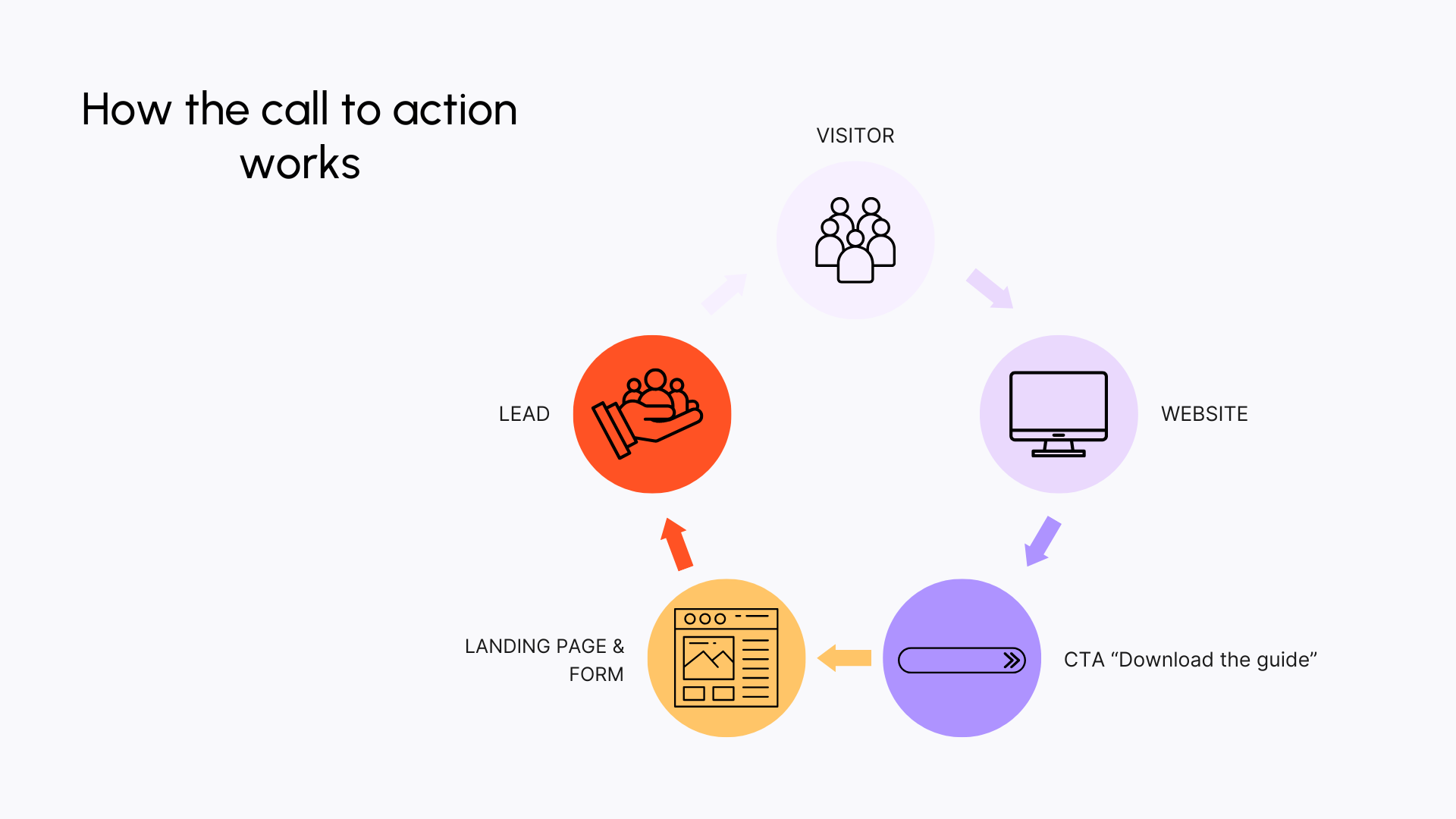
In fact, imagine your new lead receives your newsletter. You discuss your new offer and insert a "Learn More" CTA. Wanting to know more, your lead clicks on the link and, in a perfect world, wants to book an appointment. From lead, they become a prospect.
So you've understood—without CTAs, you'll struggle to reach your objectives:
- Your articles will only serve as reading material for your visitors
- Your landing pages won't be visible
- And your forms will be as useful as a sweater in a heatwave
Bottom line: without call-to-actions, your content will be purely informational. CTAs are the added value of your content.
Before Optimizing Your Website's Call-to-Actions
Building a CTA requires preparation, just like building a house without laying foundations isn't possible—or you risk ending up with a very shaky structure. That's why you must first define your objective and then establish your target audience profile.
Define Your Objective
Do you want to create one or several CTAs? Great, but what for? What actions do you want your visitors to take? Do you want them to register for a webinar? Request an appointment? Or book a demo?
Whatever the objective, it must be precise and straightforward. Don't overwhelm your audience by offering multiple choices or too many options. This could hurt your conversion rate. You need to be clear with yourself about what you want.
Know Your Target Audience
We can never say this enough, but all marketing actions start with good knowledge of your target audience! Why? Because by understanding their needs, problems, and motivations, you'll be better positioned to persuade them that your offer is exactly what they need! To do this, simply work on your buyer persona.
You can then optimize your CTAs by considering:
- Tone to use: formal or informal
- Design: color choices, typography, visuals, etc.
- Desired action: such as downloading a guide, receiving a template, getting an appointment...
What Makes a Good CTA? How to Optimize Them?
To work on and optimize your CTA, you should focus on four main elements: design, message, placement of your CTA, and testing. By following these tips, you should be able to boost your conversion rates!
Think About Your CTAs' Design
To get your visitors to click on your call-to-action, it must be sufficiently visible—meaning it should differentiate itself from the rest of the page. It should jump out at your users, immediately catching their attention.
You can, for example, test different contrasts, try different sizes and shapes for your CTA button, choose impactful colors or visuals, varied typography, etc. Whatever you choose, simply remember that visual appeal matters!
However, there are two points to respect when choosing the right color for your CTA:
- It must contrast sufficiently with the background color to be visible
- It should attract attention while matching your brand guidelines
Work on Your CTA Message
Write an Effective Offer
A CTA's objective is to push users to action. Your message must therefore be transparent and understandable: visitors should know what awaits them when clicking your CTA and what they'll get from it.
Verify that your call-to-action clearly indicates what they'll receive in exchange for their click. And above all, be concise in your messaging.
Use Action Verbs
You don't need writing talent to create a CTA. You need to be succinct and direct: choose your words carefully and eliminate unnecessary ones. And forget "click here"—it's bland and not very effective!
Prefer action verbs using the infinitive (download), imperative (download), or first person indicative (I download).
Create a Sense of Urgency
A sense of urgency is a psychological device that can become a real click catalyst! Often, when we don't click on a CTA immediately upon seeing it, there's very little chance we'll come back to it later.
But with a sense of urgency, you encourage users to take action immediately by:
- Using temporal terms like "now" or "today"
- Creating a sensation of scarcity by limiting the number of spots, for example
Be careful though—use this technique sparingly to avoid scaring off your visitors.
Choose the Right Placement for Your CTAs
Always with the objective of being easily identifiable, a CTA must have strategic and thoughtful placement. It should be highlighted and not get lost among the flood of information on your web page, article, or email.
It should be visible and easily accessible: it can be in the middle of the page, larger or more prominent, and preferably in an airy space.
To help you, put yourself in your target audience's shoes: during their visit to your website, when are they most likely to click on your call-to-action?
Also, don't forget to think mobile-responsive—a CTA on mobile won't necessarily look the same as on desktop.
Be careful not to distance readers too much from your content. Your CTA shouldn't harm their experience as a visitor.
💡 Additional CTA space: pop-up windows. These are windows that automatically display when opening a web page. They're generally used for:
- Downloading a lead magnet associated with an article (for your marketing automation strategy)
- Registration, like a newsletter or webinar
Some people might consider pop-ups intrusive. Others find them quite effective for conversion when the CTA succeeds—meaning when it:
- Offers an interesting proposition
- Relates to the page content
- Appears at an appropriate time
But the only way to verify your strategy's effectiveness is to test!
Test and Improve Your CTAs
Use A/B Testing
You can't know in advance what will work or not, even when knowing your target audience inside out. But by conducting tests, you can eliminate undesirable elements and effectively optimize your CTAs!
The principle of A/B testing is to test version A and version B of your call-to-action over a period. You then compare both versions and choose the better option—the one most effective according to your objectives and target audience.
Remember that an A/B test varies only one parameter at a time, allowing you to analyze the impact of that specific change on conversion rate. For example:
- Two different texts
- Two different colors
- Two different placements
Use the MVT Method
There's a second option: multivariate testing (MVT), a derivative of A/B testing. The idea is to find all possible associations to test for your CTA based on the number of variables.
For example, you want to change your CTA color by testing blue, orange, and green. But you also want to modify the text because you can't decide between "Request your appointment" or "Contact our team."
With this technique, you'll save time! By adding other combinations, like modifying your CTA placement (top or bottom of page), our example results in numerous different variations to test.
Automatic creation of different associations allows you to be more efficient in finding the variants that convert best!
Call-to-Action Examples (Articles, Blogs, Emails...)
A call-to-action is generally found on:
- A website
- A blog article
- An email
- Social media
Generally, the CTA leads to a landing page, which itself offers a second action to obtain the initially proposed offer. The logic often remains the same, but there can be variations depending on your target audience, their maturity level, and the desired final objective.
Example 1: Netflix's Red CTA
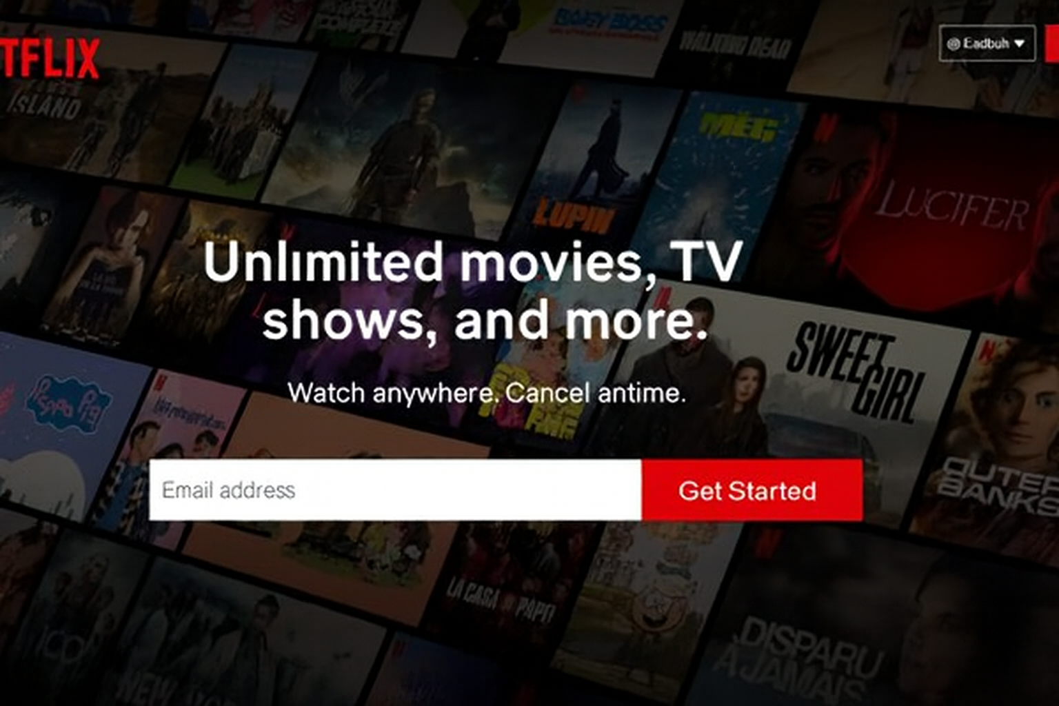
Right from the homepage, Netflix displays an imposing call-to-action. For fans of this site, you've surely noticed that over time, the CTA has evolved and undergone numerous tests.
The current CTA respects all good practices—it's highly visible (large, with clear typography and contrasting colors), the text is understandable ("Get Started"), and the colors are relevant (flashy and red, Netflix's color).
We also find "reassurance" phrases: a free offer for one month, with no commitment.
Example 2: Pinterest Registration via Facebook

If you want to register on Pinterest, several options are available: register via Facebook, Google, or email. The Facebook option is clearly highlighted by Pinterest with a blue CTA, much more visible than the Google CTA or email registration.
Pinterest probably wants to retrieve data from Facebook's API and thus keep more information about you than if you registered otherwise.
Example 3: Learn More with Apple
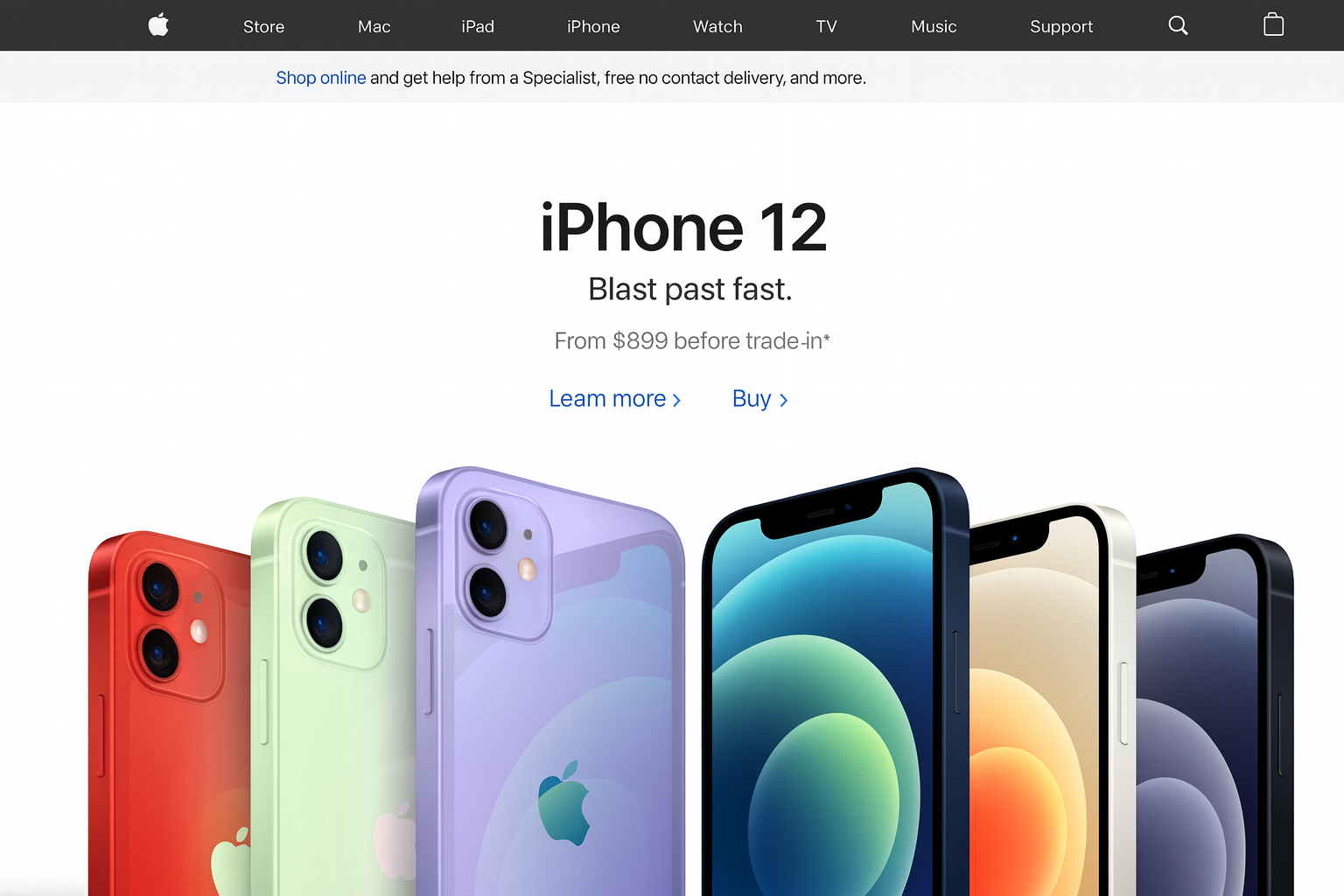
The "Learn More" CTA is commonly used. A bit mundane as phrasing, you might say, but here it works very well because it's Apple. The brand being already sufficiently anchored in consumers' minds, it doesn't need to make enormous effort to push users to take specific action.
And while the CTA isn't a button, it differentiates itself from the rest of the page through its color while staying true to the page's sober and minimalist spirit.
Example 4: With Webflow, Get Started - It's Free
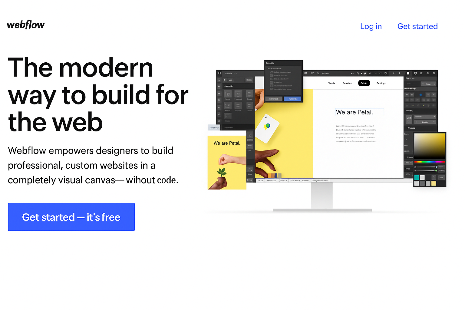
On Webflow's homepage, we find the "Get Started" CTA regularly used on this type of website to encourage visitors to use the tool. The little extra? Here Webflow adds the mention "it's free" at the end of the CTA.
Besides the flashy blue color that attracts attention, Webflow eliminates friction regarding pricing that might block users from testing their software.
FAQ: Everything About CTAs and Call-to-Actions
What is a call-to-action button?
A CTA or call-to-action translates to "call to action." It's an element containing a proposition that leads visitors to take a particular action to advance them in the marketing funnel. The CTA is therefore a digital marketing tool for converting visitors into leads, then into prospects.
Why use a call-to-action?
A call-to-action is a digital marketing tool. It tells your target audience how to continue interacting with your website to continue their journey and helps remove potential obstacles. Without a CTA, your content primarily has informational value but doesn't convert visitors into leads then prospects.
How to create a good call-to-action?
Creating an effective call-to-action requires a clear strategy: it must be concise and clearly indicate what the user will gain, with action verbs like "Download," "Subscribe," or "Discover" to stimulate engagement. Its design must be visually captivating and stand out without breaking the page's balance, often through bright colors and strategic placement (above the fold, for example). It's also essential to test different versions of your CTA and use analytical tools to optimize its performance based on user reactions (click-through rates, etc.). A good CTA allows you to accelerate your lead generation.


