Creating a landing page: Definition and examples for a page that converts
Landing pages are nothing more than pages designed for a specific stage in a user's conversion journey. They've become an indispensable tool in every solid digital marketing strategy. As an essential link in the conversion chain, you'll find them in e-commerce, online advertising, and marketing automation.
We're going to share everything you need to know on the subject, including: key elements to master for a converting landing page; tools we recommend for building your landing pages; examples of effective landing pages; and templates to take action and create better landing pages.
Expert opinion
For a landing page, conciseness is key. Your landing page must address a specific point and guide the visitor toward one single action, whether that's subscribing to a newsletter, downloading an e-book, or making a purchase. Every element on the page, from text to images, must work in harmony to guide the user toward that single action.
What is a Landing Page?
What Does "Landing Page" Actually Mean?
It's pretty funny, but everyone talks about landing pages, and when you ask the question, nobody has the same definition.
"It's what you see when you click on a Google ad"
→ If only that were really the case.
"It's a page that's not indexed on Google"
→ Huh? So if my articles are bad and don't show up in Google, does that make them landing pages?
"They're pages made with no-code tools"
→ You know that even if you don't code, at some point there will still be code for it to display, right?
"It's a page that lets you download a resource"
→ Nice try, that could work but actually no.
OK, we're not being very nice, we're being sarcastic.
Actually, it's much simpler than that.
A landing page, also called a destination page, has no particular technical characteristics. It looks technically identical to any page on your WordPress site, Webflow site, or hand-coded website.
However, unlike the regular pages on your website, it doesn't have a navigation purpose—it has one and only one objective: encourage the visitor to fill out the form or click to the next step. And it should offer no alternative to that conversion.
Landing pages are therefore pages that have been created for a very specific purpose, for a very specific stage of the conversion journey. If you can use a landing page for multiple purposes without any problem, that's probably a very bad sign (Example: Your homepage is not a landing page).
What's the Purpose of a Landing Page?
Now that we've "defined" what it was, what's a landing page for?
A landing page is the one a visitor arrives on following a particular action on their part. This page must be perfectly adapted to their journey and your conversion objective.
There are numerous use cases:
Online Advertising
Every SEA (search engine advertising) campaign should have its own landing page. If you're present on the keyword "content strategy," it's not to send someone to your homepage but to offer them to book a meeting with you to audit their content strategy.
Inbound Marketing Strategy
In inbound marketing strategies, it's important to deliver content to your visitors to help them solve their problem AND be able to identify them more precisely. Often the journey consists of attracting the user with a blog article, then pushing them to a landing page to download a resource (called a lead magnet) like a white paper, for example, obtained in exchange for an email address. There are therefore many landing pages to create as part of this type of strategy.
Free Trial
SaaS (software as a service) often offer a free trial period of a few days. When a visitor clicks on a "start my free trial" button, there's every interest in using a specific landing page to ensure they complete the registration without distraction.
There are many others, but you get the idea. During any conversion process, when the user clicks on a link or button with the goal of getting something, the landing page is there to ensure they complete that something without distraction.
It's therefore there to optimize the conversion rate, and if you follow the 10 rules for creating an effective landing page, it will do so wonderfully well!
What's the Structure of a Landing Page?
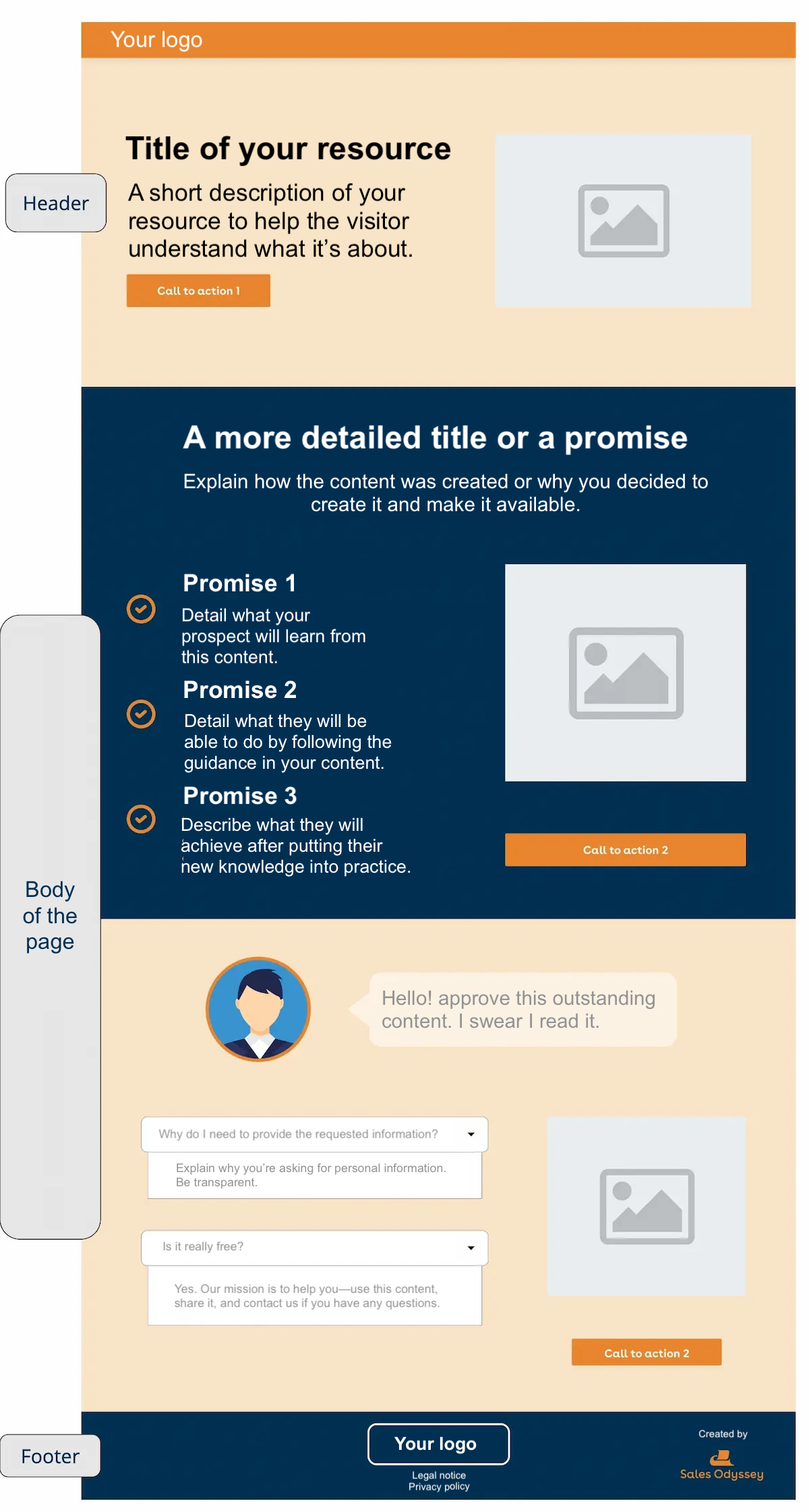
A landing page should have a simple and understandable structure for users. Even though each page will vary in content, we can divide a destination page into 3 major parts:
- The Header: This is the part above the fold. It's what users will see first and last if it's not effective. It should clearly display the value proposition, the call to action (often a form, a phone number), and social proof elements.
- The Page Body: This is below the fold. Here you can detail the value proposition, add reassurance elements, and vary formats (videos, for example). Of course, you'll insert other calls to action, but be careful—if their form varies, it's always one single action you're targeting (registration, form completion, purchase).
- The Footer: As simple as possible. Never add calls to action toward social networks or other elements that aren't directly related to the conversion action. Same goes for the menu, which is optional. Don't forget—a landing page is a conversion page, not a navigation page.
What Content for an Effective Landing Page?
To make your landing page an effective conversion tool, content plays a determining role. It must be relevant, engaging, and action-oriented. In a word, work on your copywriting!
- Title and Subtitle: They should be punchy and clear, concisely expressing the offer, its added value, and main advantage.
- Offer Description: The offer presentation should be precise and detailed while remaining concise. It should explain what the visitor will get and why it will benefit them.
- Social Proof: Customer testimonials, expert opinions, client or partner logos strengthen your offer's credibility.
- Call to Action (CTA): It should be clear and compelling, indicating exactly what the visitor should do (e.g., "Download your free e-book now").
- Images or Videos: Visual content can increase engagement and help explain your offer in a more attractive and convincing way.
It's also wise to add reassurance elements like guarantees, personal data protection, available customer service, etc.
Remember, every element on your page should serve the conversion objective.
How to Create a Killer Landing Page in 10 Lessons
Success in this exercise isn't actually that complicated. In reality, the simpler you make it, the better it will work most of the time. Furthermore, landing page optimization isn't a theoretical discipline. You'll need to test numerous variations to find the best one—the one that converts the maximum number of visitors in your case.
Lesson #1: One Landing Page = One Objective
This is the fundamental principle—you should never forget it.
A landing page has only one objective.
Half of landing page optimizations start with this: redefining and clarifying the objective.
But what does this mean exactly? It means that if you use call-to-action buttons, forms, or anything else, they should all lead to the same thing. This also applies to social media share buttons—if that's your objective, put only that, and even better, put only one!
We see too many social media share buttons on white paper download pages. NO, NO, and NO!
Either you want your visitor to download your white paper, or you want them to share something. Not both. Never.
Think that decision-making is a complex psychological process. And for every option you give, you create a decision. Because choosing to download the white paper rather than share it is 3 decisions:
- I don't share on social media
- I download the document I want
- I choose not to download & share on social media
In reality, it's even worse because they could also do nothing at all—a very tempting decision, by the way! What's more appealing than doing nothing in a world where we're over-solicited?
Sure, I'm assuming you only offered one social network, otherwise you understand it's lost, or your offer really needs to be incredible to accept making 150 decisions...
This is called the paradox of choice—the more there are, the fewer decisions we make.
Think about Sunday night in front of the Netflix catalog!
Lesson #2: Less is More—The Art of Converting by Keeping it Simple
In this guide, we'll talk very little about aesthetics, not because UI design isn't important, but because all the tricks can be summed up in one sentence: keep it simple! Once you've made it simple, simplify even more.
This is the second most used lever in landing page optimization.
It's very important because a landing page has only one goal, and any element that isn't essential is a distraction.
What does this mean concretely?
- No social media buttons if that's not the objective
- No external links
- No navigation bar (menu)
- A basic footer (legal notices)
- No need for incredible animations
- No intrusive chat box
It's sometimes tempting, especially the menu that we often see, but remember—this isn't a navigation page!
Let's take a somewhat unconventional but telling example: your page is a GPS for your visitor. GPS guides you, it gives you THE right direction. There are tons of other possible routes, but it only suggests one—it's simpler.
Adding a navigation bar is like having a GPS that would say "Turn left at the intersection, or you could also go right, and actually, if you turn around you could also see the beautiful park..."
You can visualize the hell that would be for the user, right?
Lesson #3: Call to Action and Above the Fold
All your landing pages will have what's called a call to action, which corresponds to your objective. Your pages will even have several, even though they all propose the same action (One landing page = one objective). However, it's important that the first CTA appears above the fold of the landing page.
The idea is obviously to simplify conversion as much as possible—this way there's no need to scroll to click or fill out the form.
Lesson #4: Forms on Your Landing Pages
Most of your landing pages will have in common that they propose filling out a form:
- To create an account (Registration page)
- Download a resource (In exchange for contact details)
- Subscribe to a newsletter (In exchange for an email address)
It's important that the form is short enough to be simple to fill out, but long enough not to appear too "amateur." The sweet spot statistically seems to be between 3 and 5 elements to fill out.
This is notably a study conducted on 40,000 landing pages that led to this conclusion, regarding the impact of the number of fields in a form on conversion (Source: Hubspot).
It's important not to ask for unnecessary information to reduce friction. Also, don't make the mistake of thinking that more data is better. The success of implementing a data marketing strategy depends much more on identifying the right data and exploiting it intelligently than on the quantity of data.
If you need numerous pieces of information (really need, I mean), you can imagine multi-page forms to avoid having 10 fields displayed from the start.
Lesson #5: Creating Desire with AIDA
We talked about the AIDA method in another article to structure your marketing content well. In terms of global or "macro" organization of your page, I think it's both the most effective and simplest to use. It will notably help reduce bounce rate and keep your reader's attention. What's particularly powerful in terms of persuasion and often misunderstood is the D for Desire.
Often, we settle for taking a stock photo with professionals straight out of a toothpaste ad beaming with happiness in front of an incredible invisible PowerPoint. We call that a "hero shot"—it's beautiful, it's nice, it's "useful" but... Come on! We can do a bit better to help your lead project themselves, right?
The idea is to help them understand and visualize what they'll get by filling out the form! And what they want to get thanks to your landing page is rarely to have white teeth.
If you want to increase your white paper download landing page conversion rate, it's much more effective to display a preview of the content to download than Miss or Mister Colgate in front of a brandless computer (as if that existed anyway).
In the case of a free trial, highlighting the premium features your visitor will access will also be very important. We can even enrich by showing the incredible results they'll get thanks to these "features."
So a "hero shot" to illustrate, yes. But don't get the wrong hero.
Beyond the form and this structure, think about the copywriting of your texts—it can make all the difference.
Lesson #6: Social Proof
Another powerful persuasion lever you should use for effective landing pages is the social proof mechanism.
What is social proof?
Usually, when a large number of people do something, we understand that it's the best thing to do. This fact-checking is both the strength and weakness of the social proof principle. [...] Social proof represents a convenient shortcut, but it simultaneously makes the one who takes it vulnerable to the assaults of profiteers lurking along the way.
— Robert Cialdini, Influence and Manipulation
In very many cases, we have several solutions to our problem. Our natural functioning will always be to favor the solution that's recognized and used by our peers. It's neither good nor bad—that's how it works, so use it.
However, don't cheat. We often see fake reviews—unless you're a very good forger, it will show. And we're doing marketing, we're not crooks. Don't do that—we always end up paying the bill when we cheat... Always.
Lesson #7: Authority
Authority is a principle quite similar to social proof. But unlike social proof, we don't make a choice because people like us made it, but because someone or something "superior" to us recommended it.
The authority argument is what makes you tell your aunt that herbal tea for sleeping is an old wives' tale that doesn't work when she suggests it. But if the doctor prescribes you a vervain infusion in a little cardboard box bought at the pharmacy, not only does it have a good chance of working (placebo effect), but you'll see no problem paying €20 for a box of 10...
I'm barely exaggerating.
This technique's effectiveness was demonstrated in a famous (and nonetheless frightening) experiment: The Milgram Experiment. Take time to discover it... It should help you realize the responsibility that's yours as a marketer.
Knowing how to use persuasion techniques to your advantage is good, but doing it ethically is better.
We can use this technique in a much more "harmless" way, rest assured!
For example, in a HubSpot landing page that allowed downloading a white paper, we noticed this element:
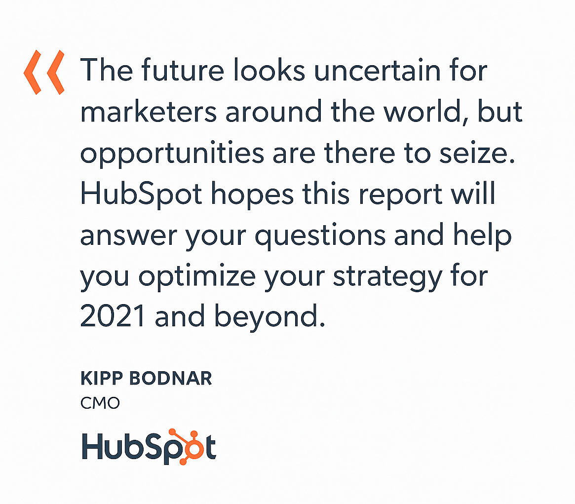
This quote from HubSpot's CMO isn't accidental. The marketing director of a company that's a reference in marketing worldwide gets involved to promote a white paper—this white paper comes out undeniably enhanced.
Especially since HubSpot's targets are marketing leaders from companies often smaller than HubSpot, so he's a model for many of them.
The white paper was very probably created without him, maybe he didn't even read it. But that's not the point—he "blessed" it, so this white paper is the bomb!
You get it?
Lesson #8: Scarcity
I'll go quickly on this point. The principle is simple—the "rarer" something is, the more we desire it. We tend to overvalue the proposition because to the desire to obtain the desired thing is added the fear of missing out on this thing if we wait.
This encourages quick decision-making.
You've seen dozens of examples with limited prices, limited quantity, etc.
This method is effective but often used abusively. If you offer a limited edition every day and it's systematically the same thing, it'll eventually show.
For example:
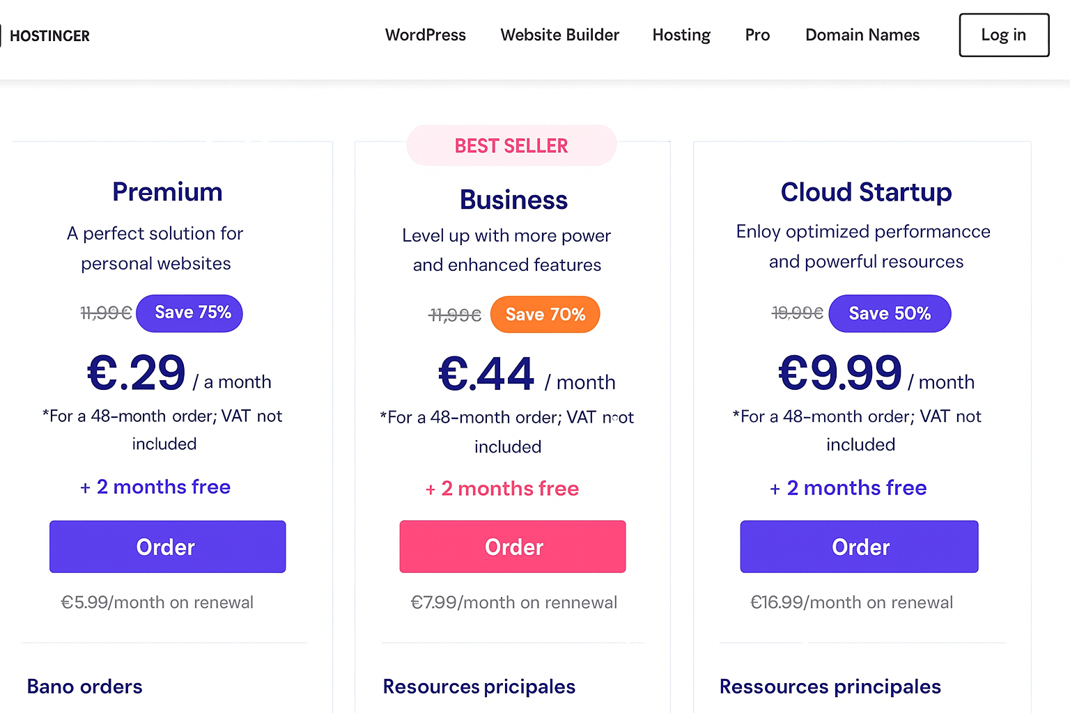
With Hostinger and their "rare" offers, you'll find it's practically impossible to pay for any service at normal price on Hostinger. IMPOSSIBLE.
The most attentive among you will also notice that this landing page (as part of an SEA campaign) has other weaknesses.
Note: I have nothing against Hostinger—on the contrary, it's an excellent host that we use ourselves on many projects.
Lesson #9: Determining the Best Landing Page with A/B Testing
After all these great principles, I'm going to try to give you advice: Be humble.
Even if you work for weeks to create the theoretically perfect landing page, test multiple versions (that's A/B testing). However skilled we might be, we're not fortune tellers.
Constantly test multiple versions, like a Darwinian marketer to relentlessly eliminate underperforming versions. Evolution theory applied to conversion!
It's important because a tiny variation can have a significant impact on conversion and therefore on your revenue.
For example, you sell a €500 product, your landing page that aims to make people buy the product receives 100 visitors each month. If version A converts 38% and version B 29%, this might seem like a small difference, but version B makes you lose €4,500.
Every month.
Even if it respects all the rules.
9 percentage points difference, 23% less revenue.
To perform A/B testing, you need a tool that allows it, and that's the subject of the final point.
Lesson #10: Choose the Right Tool to Build Your Landing Pages
Of course, the tool you choose is important. You can build a landing page with practically anything that can create a web page. But a landing page is a very particular tool and creation process. For us, there are two absolutely crucial criteria for choosing your tool:
1 - Ease of Use
Why is this most important? Because if you respect the previous rules, a complete digital marketing strategy will require a very large number of landing pages. For each of them, multiple versions will be created and tested.
That's a lot, a lot of landing pages. So having a simple tool will probably have the most impact on your work.
2 - The Ability to A/B Test Simply
Choose a tool that makes A/B testing management easy. It's time-consuming, and time is money. Make your life easier.
That's all that matters—most other options are similar from one provider to another, but test the tools and choose those that seem most intuitive to you.
We generally use Unbounce or Webflow at Sales Odyssey. But there are dozens of other tools.
Examples of Effective Landing Pages
Semrush Landing Page Example
I'll tell you right away—I find this landing page close to perfection!
Short, clear, everything is in its place and without any obstacle... So good that we now have 2 Guru licenses at Sales Odyssey...
The Landing Screen
- A clear and catchy promise, subtitled to understand the scope of action
- A clear call-to-action button at the center of the screen
- Immediate use of social proof with client company logos. This could also be authority depending on the size of the company arriving on this page
- No menu, no chat... just conversion, that's all
The Landing Page Body
Quantified elements and feature details presented concisely. I particularly draw your attention to the fact that it's not a simple screenshot—on the live page, the image is interactive and highlights specific points ("show me around").
We see the call to action reappear regularly—it's the same throughout the page.
Landing Page Footer
Authority argument with awards won by Semrush. We then find links to pages containing essential information about the company like their legal notices and privacy policy.
I couldn't generate a B version of this page. The teams that created this page are clearly very competent, so I simply think this page's conversion rate has reached high levels and is therefore currently unchallenged.
Well played!
HubSpot Landing Page Example
Second example with HubSpot to create a free CRM account.
The page is also very well structured, and I find it interesting to have such a simple page.
First Screen Above the Fold
Simple and effective. The illustration is clear and nice. We find the same effectiveness as in the previous one:
- A clear and effective promise
- An equally simple CTA
- No menu
- An authority argument at the top with "Google Partner" right next to HubSpot's logo
The Destination Page Body
The initial promise is specified with four simple commercial arguments, which after a short description all propose the same call to action to create a free account.
A client review is added as social proof.
Unbeatable.
The Landing Page Footer
No frills, just effectiveness:
- We find the CTA
- Legal elements
- Well, they also have a small badge to activate chat. I think that's simply so we say it's not perfect ;-)
If you find this approach appealing, you should know that HubSpot offers its own landing page builder, which makes it easy to create this kind of conversion-optimized pages.
Three Landing Page Templates to Guide You
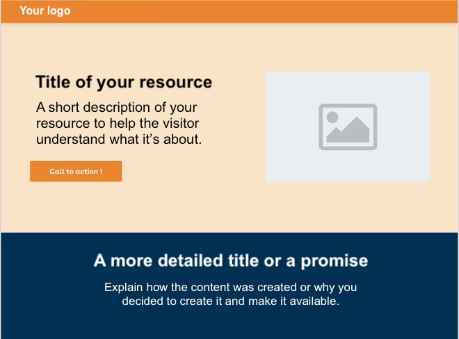
Resource Download Landing Page Template
In B2B, this is one of the templates that will be most useful to you! Indeed, a good content strategy often makes all the difference in developing your business. With this template, you'll be able to offer premium content for download, which is an excellent way to get acquainted with your visitors and understand their challenges.
We suggest implementing:
- The A.I.D.A method
- The authority principle
More generally, it's a template that allows projecting your visitor into using your content.
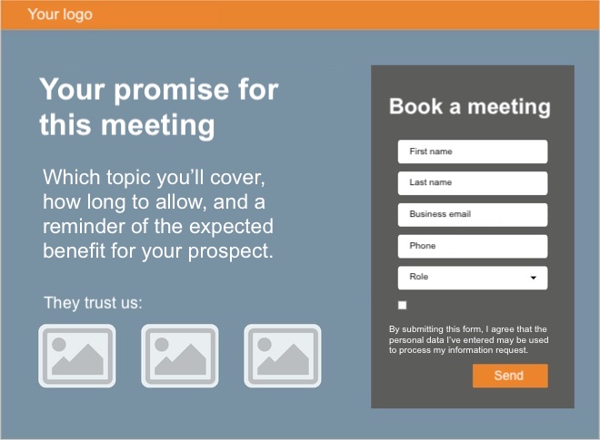
Appointment Booking Landing Page Template
This template is obviously key—this type of landing page is the heart of your lead generation system. We can, for example, use it as part of a free consultation offer. It's very engaging for your prospect, and if someone wants an appointment, you must be absolutely sure your landing page will "reassure" them so they complete the form.
In this template, we'll notably see:
- The A.I.D.A method
- Social proof
And as always, we'll help the visitor project themselves with you.
Free Trial Registration Template
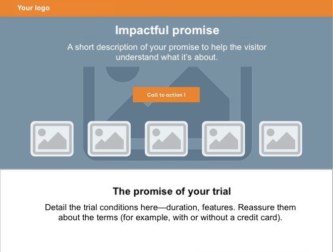
The last template we offer: The free trial.
This is particularly useful for those of you who work in SaaS (software as a service). Here again, the promise seems too good to require conversion work, but that's not the case. Whatever your tool's incredible "features," you have 100 competitors, so when a prospect arrives on your landing page, you'd better be sure you can convert them.
Key Takeaways for Your Landing Pages
What is a Landing Page?
A landing page is a perfectly normal web page, except that it was built for a specific purpose and is entirely devoted to it. It's therefore not a navigation page but a conversion page. We can also call it a destination page.
What Examples of Use for a Landing Page?
The fact that this page has only one single goal makes it much more effective at achieving the objective: conversion. It's therefore an ideal medium for your web advertising campaigns, marketing automation, or digital communication operations.
How to Create a Good Landing Page?
There are many tricks—we detail 10 in this article. If only one should remain: "keep it stupidly simple!" That's generally what's most effective. A landing page should eliminate all distractions with the goal of taking the visitor where you want to take them.


